
A frame is just a frame right? Something that simply holds your photo or artwork? So choosing the right frame should be easy?
Well in the case of GREAT custom framing results, it’s really not just a frame and choosing the right one needs exceptional design skills from a highly skilled framer.
Custom designed framing is an entirely different beast to simply ‘putting a frame around something’.
In this blog post I’m going to outline one of the first mistakes people make when starting their custom framing projects with a framer. This is also relates to the misconception around costs and value of your custom framing job. It’s important from the outset to understand that you always get what you pay for.
Choosing a frame that doesn’t work at all
Choosing a frame that DOESN’T relate, match, or blend with the artwork results in the framing not connecting with the artwork. To be blunt it’s akin to throwing your money down the drain because the finished frame is one you will never be happy with, never enjoy looking at and it will turn you off custom framing for life… and worse still you won’t see the value in the money you’ve already spent.
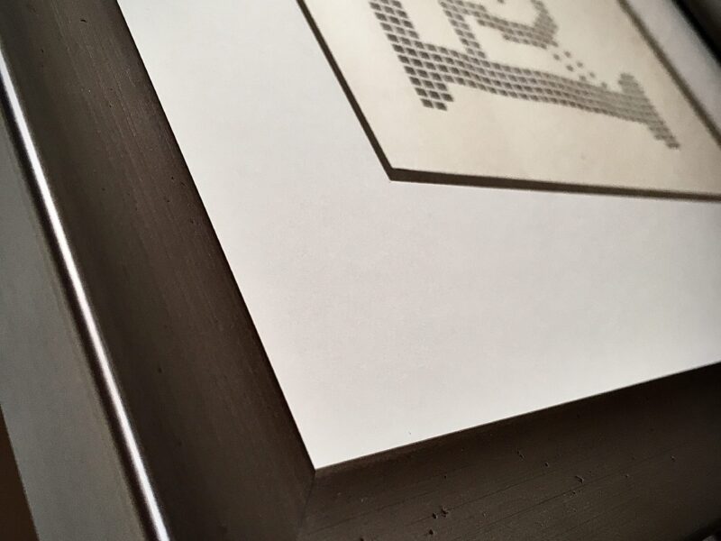
A great frame needs to either be a natural extension of the artwork or a complimenting presentation package. Just as the painter used colours in a paint palette to create the painting, great framers must use the artwork as their palette. The frame needs to be in complete balance with the artwork.
Here’s what you need to remember when choosing a suitable frame: remember that all of these are dictated from the artwork itself!
To really understand the value of your frame it’s really important to know what your frame is made from.Expert custom framers know and understand the different materials used for various different framing purposes. If you don’t ask enough ‘what’ questions you may end up with a frame that does not meet your expectation, you may […]