Following on from last week’s post about choosing the right frame, I wanted to discuss the important role that proper matboards play within the overall framing design and why they are far more than ‘just a bit of cardboard.’
Why are matboards so important?
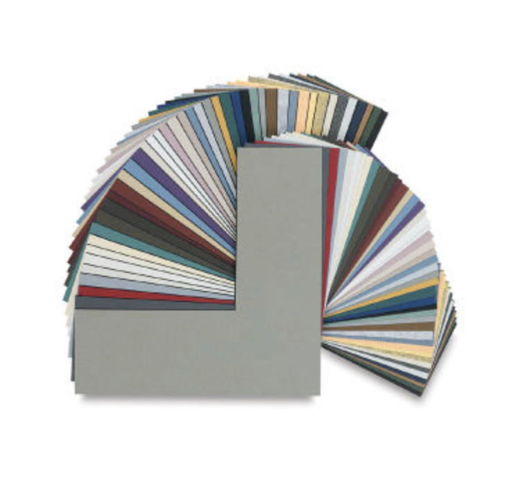
Matboards are an integral part of any framing design. They provide protection and support for your artwork especially if they are of conservation quality. Their functional role cannot be understated, especially on valuable works of art that require material preservation. Using matboards made from conservation grade materials like alpha-cellulose or cotton provides a benign environment and ensures that no other destructive elements can further deteriorate the paper. They also create a space between the artwork and the glass to ensure that moisture doesn’t develop and adhere to the artwork over time.
How important are they to successful design?
Matboards are an opportunity to pick up colours from the artwork or photo and extend them into the framing. However there are some considerations around what colours and how to pick them up in the matting.
When choosing mat colours these 3 things are critical to a cohesive and successful framing design.
What do good and bad examples look like?


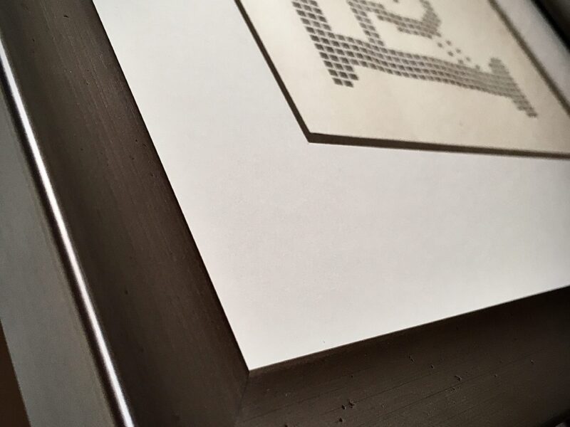
To really understand the value of your frame it’s really important to know what your frame is made from.Expert custom framers know and understand the different materials used for various different framing purposes. If you don’t ask enough ‘what’ questions you may end up with a frame that does not meet your expectation, you may […]